Overview
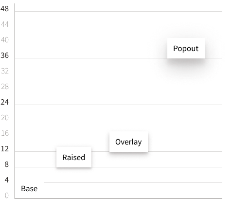
Distinguish content blocks with an Elevation system to convey proximity, prominence, and visual depth.
Variants
Popout
Sass
$shadow-size-popoutCSS
        box-shadow:

          0 1.2rem 1.2rem -1.2rem rgba(73, 68, 64, .15),

          0 2.4rem 3.6rem   .4rem rgba(73, 68, 64, .15),

          0  .8rem 4.8rem   .8rem rgba(73, 68, 64, .15)

        ;
Overlay
Raised
Sass
$shadow-size-raisedCSS
        box-shadow:

          0 .2rem  .4rem -.4rem rgba(73, 68, 64, .15),

          0 .4rem  .4rem  0     rgba(73, 68, 64, .15),

          0 .2rem 1.2rem  0     rgba(73, 68, 64, .15)

        ;
Elevation

Usage
CSS Classes
Refer to CSS Utilities / Shadows to selectively apply shadows to content blocks.
<div class="fsa-shadow--raised">Raised</div>
Raised
Sass
fsa-style has each shadow in the form of Sass variables (tokens).
// fsa-style/src/stylesheets/core/_fsa.variables.scss
$shadow-size-popout
$shadow-size-overlay
$shadow-size-raised
$shadow-size-none
// Applying with SCSS
.custom-component {
  box-shadow: $shadow-size-[VARIANT];
}
UI Components
Available components implementing Shadows:
 An official website of the United States Government