 An official website of the United States Government
Overview
Data entry from a variety of structured form controls.
Preview
View Kitchen SinkCreate application forms with appropriate instructional and validation features.
Anatomy
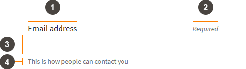
<div class="fsa-field">
  <label class="fsa-field__label" for="lorem-1234">Email address <span class="fsa-field__label-desc">Required</span></label>
  <input class="fsa-input fsa-field__item" id="lorem-1234" name="lorem-1234" aria-describedby="lorem-1234-help-1" aria-required="true" type="email" value="">
  <span class="fsa-field__help" id="lorem-1234-help-1">This is how people can contact you</span>
</div>
| Marker | Selector | Description | Required |
|---|---|---|---|
| 1 | fsa-field__label |
Provide the standard style and position of the label of the form element |
|
| 2 | fsa-field__label-desc |
Paired with fsa-field__label |
|
| 3 | fsa-field__item |
||
| 4 | fsa-field__help |
Provides instructional text in a standardized location |
|
| 5 | fsa-field__message |
Provides validation and error messaging in standardized location, e.g. Error state |
Usage
Variants and Examples
Text
Using Text Input as core component.
<div class="fsa-field">
  <label class="fsa-field__label" for="TheItem2">Label <span class="fsa-field__label-desc">Required</span></label>
  <input class="fsa-input fsa-field__item" id="TheItem2" aria-describedby="lorem-1234-help-2" aria-required="true" name="TheItem2" type="text" value="">
  <span class="fsa-field__help" id="lorem-1234-help-2">Instructional message here</span>
</div>
Text, Fill
<div class="fsa-field fsa-field--fill">
  <label class="fsa-field__label" for="TheItem5">Label <span class="fsa-field__label-desc">Required</span></label>
  <input class="fsa-input fsa-field__item" id="TheItem5" aria-describedby="lorem-1234-help-5" aria-required="true" name="TheItem5" type="text" value="">
  <span class="fsa-field__help" id="lorem-1234-help-5">Instructional message here</span>
</div>
Text, Prefix
<div class="fsa-field">
  <label class="fsa-field__label" for="lorem-778affixs459">Wheat <span class="fsa-field__label-desc">Required</span></label>
  <span class="fsa-affix fsa-affix--fill">
    <label for="lorem-778affixs459" class="fsa-affix__prefix" aria-hidden="true" title="Dollars">$</label>
    <input class="fsa-input fsa-field__item fsa-affix__item" id="lorem-778affixs459" name="lorem-778affixs459" type="text" value="" aria-required="true" aria-describedby="lorem-778affixs459_help">
  </span>
  <span class="fsa-field__help" id="lorem-778affixs459_help">Price of Wheat per bushel</span>
</div>
Text, Prefix Icon
<div class="fsa-field">
  <label class="fsa-field__label" for="lorem-778affixicons459">Credit Card Number <span class="fsa-field__label-desc">Required</span></label>
  <span class="fsa-affix fsa-affix--fill">
    <label for="lorem-778affixicons459" class="fsa-affix__prefix" aria-hidden="true"><svg class="fsa-icon fsa-icon--size-2" aria-hidden="true" focusable="false" role="img" fill="#494440" xmlns="http://www.w3.org/2000/svg" width="24" height="24" viewBox="0 0 24 24"><path d="M20 4H4c-1.11 0-1.99.89-1.99 2L2 18c0 1.11.89 2 2 2h16c1.11 0 2-.89 2-2V6c0-1.11-.89-2-2-2zm0 14H4v-6h16v6zm0-10H4V6h16v2z"></path></svg></label>
    <input class="fsa-input fsa-field__item fsa-affix__item" id="lorem-778affixicons459" name="lorem-778affixicons459" type="text" value="" aria-required="true" aria-describedby="lorem-778affixicons459_help">
  </span>
</div>
Text, Suffix
<div class="fsa-field">
  <label class="fsa-field__label" for="lorem-778suffixs459">Lot Size <span class="fsa-field__label-desc">Required</span></label>
  <span class="fsa-affix fsa-affix--fill">
    <input class="fsa-input fsa-field__item fsa-affix__item" id="lorem-778suffixs459" name="lorem-778suffixs459" type="text" value="" aria-required="true" aria-describedby="lorem-778suffixs459_help">
    <label for="lorem-778suffixs459" class="fsa-affix__suffix" aria-hidden="true" title="Dollars">acres</label>
  </span>
</div>
Multi-part
<div class="fsa-field">
  <label class="fsa-field__label" for="lorem-dob__month">Date of Birth</label>
  <div class="fsa-level">
    <div>
      <input size="1" class="fsa-input fsa-field__item" id="lorem-dob__month" name="lorem-dob__month" aria-describedby="lorem-dob__help" aria-required="true" type="text" value="">
      <label class="fsa-field__label fsa-text-size--2" for="lorem-dob__month">Month</label>
    </div>
    <div>
      <input size="1" class="fsa-input fsa-field__item" id="lorem-dob__day" name="lorem-dob__day" aria-describedby="lorem-dob__help" aria-required="true" type="text" value="">
      <label class="fsa-field__label fsa-text-size--2" for="lorem-dob__day">Day</label>
    </div>
    <div>
      <input size="3" class="fsa-input fsa-field__item" id="lorem-dob__year" name="lorem-dob__year" aria-describedby="lorem-dob__help" aria-required="true" type="text" value="">
      <label class="fsa-field__label fsa-text-size--2" for="lorem-dob__year">Year</label>
    </div>
  </div>
  <span class="fsa-field__help" id="lorem-dob__help">Example: 05 14 1981</span>
</div>
Text, Custom Width
The width of .fsa-field’s use of .fsa-input defaults to fill the bounds its parent container (i.e. .fsa-field). Though it should be rarely necessary, it can be overridden with the size attribute, which specifies the width of the input in number of characters. From a display perspective, one character is equivalent to 1em (approximately 17px wide at default font size).
<div class="fsa-field">
  <label class="fsa-field__label" for="lorem-0128">Label</label>
  <input class="fsa-input fsa-field__item" id="lorem-0128" name="lorem-0128" type="text" value="" size="4">
</div>
<div class="fsa-field">
  <label class="fsa-field__label" for="lorem-6719">Label</label>
  <input class="fsa-input fsa-input--fill fsa-field__item" id="lorem-6719" name="lorem-6719" type="text" value="" size="14">
</div>
Textarea
Using Textarea as core component.
<div class="fsa-field">
  <label class="fsa-field__label" for="UNIQUE-ID-88s8SUGg">Label <span class="fsa-field__label-desc">Required</span></label>
  <textarea class="fsa-textarea fsa-field__item" placeholder="Placeholder" id="UNIQUE-ID-88s8SUGg" aria-describedby="lorem-88s8SUGg-help-4" aria-required="true" name="UNIQUE-ID-88s8SUGg"></textarea>
  <span class="fsa-field__help" id="lorem-88s8SUGg-help-4">Instructional message here</span>
</div>
Textarea, Fill
<div class="fsa-field fsa-field--fill">
  <label class="fsa-field__label" for="UNIQUE-ID-yyss88xx22x2x2">Label <span class="fsa-field__label-desc">Required</span></label>
  <textarea class="fsa-textarea fsa-field__item fsa-field__item--" placeholder="Placeholder" id="UNIQUE-ID-yyss88xx22x2x2" aria-describedby="lorem-yyss88xx22x2x2-help-4" aria-required="true" name="UNIQUE-ID-yyss88xx22x2x2"></textarea>
  <span class="fsa-field__help" id="lorem-yyss88xx22x2x2-help-4">Instructional message here</span>
</div>
Checkbox List
Using Checkboxes as core component.
<div class="fsa-field">
  <label class="fsa-field__label" id="unique-id-lorem--1234">Pies We Like</label>
  <ul class="fsa-form-list" aria-labelledby="unique-id-lorem--1234">
    <li>
      <span>
        <input class="fsa-checkbox" id="apple" type="checkbox" name="pie" checked="">
        <label for="apple">Apple</label>
      </span>
    </li>
    <li>
      <span>
        <input class="fsa-checkbox" id="key-lime" type="checkbox" name="pie">
        <label for="key-lime">Key Lime</label>
      </span>
    </li>
    <li>
      <span>
        <input class="fsa-checkbox" id="pumpkin" type="checkbox" name="pie">
        <label for="pumpkin">Pumpkin</label>
      </span>
    </li>
  </ul>
  <span class="fsa-field__help" id="lorem-yywqqq8iyxx2x2-help-8">Helpful message here</span>
</div>
Radio List
Using Radio as core component.
<div class="fsa-field">
  <label class="fsa-field__label" id="lorem-radio-field-1">Your Favorite Pie</label>
  <ul class="fsa-form-list" aria-labelledby="lorem-radio-field-1">
    <li>
      <span>
        <input class="fsa-radio" id="apple-radio" type="radio" name="fav-pie-zz99">
        <label for="apple-radio">Apple</label>
      </span>
    </li>
    <li>
      <span>
        <input class="fsa-radio" id="key-lime-radio" type="radio" name="fav-pie-zz99">
        <label for="key-lime-radio">Key Lime</label>
      </span>
    </li>
    <li>
      <span>
        <input class="fsa-radio" id="pumpkin-radio" type="radio" name="fav-pie-zz99">
        <label for="pumpkin-radio">Pumpkin</label>
      </span>
    </li>
    <li>
      <span>
        <input class="fsa-radio" id="none-radio" type="radio" name="fav-pie-zz99" checked>
        <label for="none-radio">None of the above</label>
      </span>
    </li>
  </ul>
  <span class="fsa-field__help" id="lorem-yyss8cytr2x2x2-help-9">Helpful message here</span>
</div>
Select
Using Select as core component.
<div class="fsa-field">
  <label class="fsa-field__label" for="UNIQUE-ID-hshhsjtext">Label <span class="fsa-field__label-desc">Required</span></label>
  <select class="fsa-select fsa-field__item" id="UNIQUE-ID-hshhsjtext" aria-describedby="lorem-hshhsjtext-help-4" aria-required="true" name="UNIQUE-ID-hshhsjtext">
    <option value="Option A" selected="selected">Option A</option>
    <option value="Option B">Option B</option>
    <option value="Option C">Option C</option>
    <option value="Option D">Option D</option>
    <option value="Option E">Option E</option>
  </select>
  <span class="fsa-field__help" id="lorem-hshhsjtext-help-4">Instructional message here</span>
</div>
Select, Fill Variant
<div class="fsa-field fsa-field--fill">
  <label class="fsa-field__label" for="UNIQUE-ID-ssrrppou9">Label <span class="fsa-field__label-desc">Required</span></label>
  <select class="fsa-select fsa-field__item" id="UNIQUE-ID-ssrrppou9" aria-describedby="lorem-ssrrppou9-help-4" aria-required="true" name="UNIQUE-ID-ssrrppou9">
    <option value="Option A" selected="selected">Option A</option>
    <option value="Option B">Option B</option>
    <option value="Option C">Option C</option>
    <option value="Option D">Option D</option>
    <option value="Option E">Option E</option>
  </select>
  <span class="fsa-field__help" id="lorem-ssrrppou9-help-4">Instructional message here</span>
</div>
Select Multi
Using Select Multi as core component.
- First Group
- Second Group
- Third Group
<div class="fsa-field">
  <label class="fsa-field__label" for="UNIQUE-ID-hshhsjtext">Label</label>
  <div class="fsa-select-multi fsa-field__item">
    <ul class="fsa-select-multi__list">
      <li class="fsa-select-multi__item fsa-select-multi__item--group" role="heading" aria-level="4">
        First Group
      </li>
      <li class="fsa-select-multi__item">
        <input class="fsa-checkbox fsa-select-multi__check" id="opt-group-example_one" type="checkbox" name="opt-group-example_one" value="One" checked="">
        <label class="fsa-select-multi__label" for="opt-group-example_one">One</label>
      </li>
      <li class="fsa-select-multi__item">
        <input class="fsa-checkbox fsa-select-multi__check" id="opt-group-example_two" type="checkbox" name="opt-group-example_two" value="Two">
        <label class="fsa-select-multi__label" for="opt-group-example_two">Two</label>
      </li>
      <li class="fsa-select-multi__item fsa-select-multi__item--group" role="heading" aria-level="4">
        Second Group
      </li>
      <li class="fsa-select-multi__item">
        <input class="fsa-checkbox fsa-select-multi__check" id="opt-group-examplehree" type="checkbox" name="opt-group-examplehree" value="Three" checked="">
        <label class="fsa-select-multi__label" for="opt-group-examplehree">Three</label>
      </li>
      <li class="fsa-select-multi__item">
        <input class="fsa-checkbox fsa-select-multi__check" id="opt-group-examplefour" type="checkbox" name="opt-group-examplefour" value="Four" checked="">
        <label class="fsa-select-multi__label" for="opt-group-examplefour">Four</label>
      </li>
      <li class="fsa-select-multi__item">
        <input class="fsa-checkbox fsa-select-multi__check" id="opt-group-examplefive" type="checkbox" name="opt-group-examplefive" value="Five">
        <label class="fsa-select-multi__label" for="opt-group-examplefive">Five</label>
      </li>
      <li class="fsa-select-multi__item fsa-select-multi__item--group" role="heading" aria-level="4">
        Third Group
      </li>
      <li class="fsa-select-multi__item">
        <input class="fsa-checkbox fsa-select-multi__check" id="opt-group-example_six" type="checkbox" name="opt-group-example_six" value="Six">
        <label class="fsa-select-multi__label" for="opt-group-example_six">Six</label>
      </li>
      <li class="fsa-select-multi__item">
        <input class="fsa-checkbox fsa-select-multi__check" id="opt-group-exampleeven" type="checkbox" name="opt-group-exampleeven" value="Seven">
        <label class="fsa-select-multi__label" for="opt-group-exampleeven">Seven</label>
      </li>
      <li class="fsa-select-multi__item">
        <input class="fsa-checkbox fsa-select-multi__check" id="opt-group-exampleight" type="checkbox" name="opt-group-exampleight" value="Eight">
        <label class="fsa-select-multi__label" for="opt-group-exampleight">Eight</label>
      </li>
      <li class="fsa-select-multi__item">
        <input class="fsa-checkbox fsa-select-multi__check" id="opt-group-examplenine" type="checkbox" name="opt-group-examplenine" value="Nine">
        <label class="fsa-select-multi__label" for="opt-group-examplenine">Nine</label>
      </li>
      <li class="fsa-select-multi__item">
        <input class="fsa-checkbox fsa-select-multi__check" id="opt-group-exampleten" type="checkbox" name="opt-group-exampleten" value="Nine">
        <label class="fsa-select-multi__label" for="opt-group-exampleten">Ten</label>
      </li>
      <li class="fsa-select-multi__item">
        <input class="fsa-checkbox fsa-select-multi__check" id="opt-group-exampleeleven" type="checkbox" name="opt-group-exampleeleven" value="Nine">
        <label class="fsa-select-multi__label" for="opt-group-exampleeleven">Eleven</label>
      </li>
      <li class="fsa-select-multi__item">
        <input class="fsa-checkbox fsa-select-multi__check" id="opt-group-exampletwelve" type="checkbox" name="opt-group-exampletwelve" value="Nine">
        <label class="fsa-select-multi__label" for="opt-group-exampletwelve">Twelve</label>
      </li>
      <li class="fsa-select-multi__item">
        <input class="fsa-checkbox fsa-select-multi__check" id="opt-group-examplethirteen" type="checkbox" name="opt-group-examplethirteen" value="Nine">
        <label class="fsa-select-multi__label" for="opt-group-examplethirteen">Thirteen</label>
      </li>
      <li class="fsa-select-multi__item">
        <input class="fsa-checkbox fsa-select-multi__check" id="opt-group-examplefourteen" type="checkbox" name="opt-group-examplefourteen" value="Nine">
        <label class="fsa-select-multi__label" for="opt-group-examplefourteen">Fourteen</label>
      </li>
      <li class="fsa-select-multi__item">
        <input class="fsa-checkbox fsa-select-multi__check" id="opt-group-examplefifteen" type="checkbox" name="opt-group-examplefifteen" value="Nine">
        <label class="fsa-select-multi__label" for="opt-group-examplefifteen">Fifteen</label>
      </li>
      <li class="fsa-select-multi__item">
        <input class="fsa-checkbox fsa-select-multi__check" id="opt-group-examplesixteen" type="checkbox" name="opt-group-examplesixteen" value="Nine">
        <label class="fsa-select-multi__label" for="opt-group-examplesixteen">Sixteen</label>
      </li>
      <li class="fsa-select-multi__item">
        <input class="fsa-checkbox fsa-select-multi__check" id="opt-group-exampleseventeen" type="checkbox" name="opt-group-exampleseventeen" value="Nine">
        <label class="fsa-select-multi__label" for="opt-group-exampleseventeen">Seventeen</label>
      </li>
    </ul>
  </div>
  <span class="fsa-field__help" id="lorem-hshhsjtext-help-4">Instructional message here</span>
</div>
Select Multi, Fill Variant
<div class="fsa-field fsa-field--fill">
  <label class="fsa-field__label" for="UNIQUE-ID-hshmul6tihsjt">Label</label>
  <div class="fsa-select-multi fsa-field__item">
    <ul class="fsa-select-multi__list" id="UNIQUE-ID-hshmul6tihsjt" aria-describedby="lorem-hshmul6tihsjt-help-4">
      <li class="fsa-select-multi__item">
        <input class="fsa-checkbox fsa-select-multi__check" id="default-t9kstp31a_one" type="checkbox" name="default-t9kstp31a_one" value="One" checked="">
        <label class="fsa-select-multi__label" for="default-t9kstp31a_one">One</label>
      </li>
      <li class="fsa-select-multi__item">
        <input class="fsa-checkbox fsa-select-multi__check" id="default-t9kstp31a_two" type="checkbox" name="default-t9kstp31a_two" value="Two">
        <label class="fsa-select-multi__label" for="default-t9kstp31a_two">Two</label>
      </li>
      <li class="fsa-select-multi__item">
        <input class="fsa-checkbox fsa-select-multi__check" id="default-t9kstp31a_three" type="checkbox" name="default-t9kstp31a_three" value="Three" checked="">
        <label class="fsa-select-multi__label" for="default-t9kstp31a_three">Three</label>
      </li>
      <li class="fsa-select-multi__item">
        <input class="fsa-checkbox fsa-select-multi__check" id="default-t9kstp31a_four" type="checkbox" name="default-t9kstp31a_four" value="Four" checked="">
        <label class="fsa-select-multi__label" for="default-t9kstp31a_four">Four</label>
      </li>
      <li class="fsa-select-multi__item">
        <input class="fsa-checkbox fsa-select-multi__check" id="default-t9kstp31a_five" type="checkbox" name="default-t9kstp31a_five" value="Five">
        <label class="fsa-select-multi__label" for="default-t9kstp31a_five">Five</label>
      </li>
      <li class="fsa-select-multi__item">
        <input class="fsa-checkbox fsa-select-multi__check" id="default-t9kstp31a_six" type="checkbox" name="default-t9kstp31a_six" value="Six">
        <label class="fsa-select-multi__label" for="default-t9kstp31a_six">Six</label>
      </li>
      <li class="fsa-select-multi__item">
        <input class="fsa-checkbox fsa-select-multi__check" id="default-t9kstp31a_seven" type="checkbox" name="default-t9kstp31a_seven" value="Seven">
        <label class="fsa-select-multi__label" for="default-t9kstp31a_seven">Seven</label>
      </li>
      <li class="fsa-select-multi__item">
        <input class="fsa-checkbox fsa-select-multi__check" id="default-t9kstp31a_eight" type="checkbox" name="default-t9kstp31a_eight" value="Eight">
        <label class="fsa-select-multi__label" for="default-t9kstp31a_eight">Eight</label>
      </li>
      <li class="fsa-select-multi__item">
        <input class="fsa-checkbox fsa-select-multi__check" id="default-t9kstp31a_nine" type="checkbox" name="default-t9kstp31a_nine" value="Nine">
        <label class="fsa-select-multi__label" for="default-t9kstp31a_nine">Nine</label>
      </li>
    </ul>
  </div>
  <span class="fsa-field__help" id="lorem-hshmul6tihsjt-help-4">Instructional message here</span>
</div>
Date Picker
Using Date Picker as core component.
<div class="fsa-field">
  <label class="fsa-field__label" for="date-picker-default">Start Date</label>
  <input placeholder="mm/dd/yyyy" class="fsa-input fsa-field__item" id="date-picker-default" aria-describedby="date-picker-default__help" aria-required="true" name="date-picker-default" type="text" value="">
  <span class="fsa-field__help" id="date-picker-default__help">Example 05/14/1975</span>
</div>
Spinbox
Using Spinbox as core component.
<div class="fsa-field">
  <label class="fsa-field__label" for="UNIQUE-ID-spinsa22">Label</label>
  <div class="fsa-spinbox fsa-field__item">
    <div class="fsa-spinbox__number">
      <input class="fsa-input fsa-spinbox__input" type="number" value="10" id="UNIQUE-ID-spinsa22" aria-describedby="UNIQUE-ID-spinsa22-help" name="UNIQUE-ID-spinsa22">
    </div>
    <div class="fsa-spinbox__actions" aria-hidden="true">
      <button tabindex="-1" class="fsa-spinbox__btn fsa-spinbox__btn--increment" type="button" data-behavior="spinbox-spin" title="Increase"></button>
      <button tabindex="-1" class="fsa-spinbox__btn fsa-spinbox__btn--decrement" type="button" data-behavior="spinbox-spin" title="Decrease"></button>
    </div>
  </div>
  <span class="fsa-field__help" id="UNIQUE-ID-spinsa22-help">Instructional message here</span>
</div>
Spinbox, Fill Variant
<div class="fsa-field fsa-field--fill">
  <label class="fsa-field__label" for="UNIQUE-ID-spinsawsqz">Label</label>
  <div class="fsa-spinbox fsa-field__item">
    <div class="fsa-spinbox__number">
      <input class="fsa-input fsa-spinbox__input" type="number" value="10" id="UNIQUE-ID-spinsawsqz" aria-describedby="UNIQUE-ID-spinsawsqz-help" name="UNIQUE-ID-spinsawsqz">
    </div>
    <div class="fsa-spinbox__actions" aria-hidden="true">
      <button tabindex="-1" class="fsa-spinbox__btn fsa-spinbox__btn--increment" type="button" data-behavior="spinbox-spin" title="Increase"></button>
      <button tabindex="-1" class="fsa-spinbox__btn fsa-spinbox__btn--decrement" type="button" data-behavior="spinbox-spin" title="Decrease"></button>
    </div>
  </div>
  <span class="fsa-field__help" id="UNIQUE-ID-spinsawsqz-help">Instructional message here</span>
</div>
Upload File
<div class="fsa-field">
  <label class="fsa-field__label" for="uploadexample02020">Upload image preview</label>
  <input placeholder="Choosie choose choose something" accept="image/png, image/jpeg, image/gif" multiple class="fsa-input fsa-field__item" id="uploadexample02020" aria-describedby="lorem-1234-02020" aria-required="true" name="uploadexample02020" type="file" value="">
  <span class="fsa-field__help" id="lorem-1234-02020">Accepted file types: PNG, JPG, GIF</span>
</div>
Slider
Using the Slider as core component.
<div class="fsa-field">
  <label class="fsa-field__label" for="lorem-range-7710">Label <span class="fsa-field__label-desc">Required</span></label>
  <div class="fsa-level">
    <span class="fsa-level__item--grow-auto">
      <input class="fsa-slider fsa-field__item" id="lorem-range-7710" name="lorem-range-7710" type="range" min="0" max="100" value="90" step="1">
    </span>
    <span><output id="lorem-range-ouput-7710" name="lorem-range-ouput-7710" for="lorem-range-7710">90</output></span>
  </div>
</div>
Progressive Disclosure, or “Other”
A UI Pattern for revealing an additional form field upon selection of an “Other” option (though actual label can of course be something other than… um… “other”).
Radio
<div class="fsa-field">
  <label class="fsa-field__label" id="lorem-radio-field-33aa">Your Favorite Pie</label>
  <ul class="fsa-form-list" aria-labelledby="lorem-radio-field-33aa">
    <li>
      <span>
        <input class="fsa-radio" id="apple-radio-33aa" type="radio" name="fav-pie">
        <label for="apple-radio-33aa">Apple</label>
      </span>
    </li>
    <li>
      <span>
        <input class="fsa-radio" id="key-lime-radio-33aa" type="radio" name="fav-pie">
        <label for="key-lime-radio-33aa">Key Lime</label>
      </span>
    </li>
    <li>
      <span>
        <input class="fsa-radio" id="pumpkin-radio-33aa" type="radio" name="fav-pie">
        <label for="pumpkin-radio-33aa">Pumpkin</label>
      </span>
    </li>
    <li>
      <div>
        <input class="fsa-radio" id="none-radio-33aa" type="radio" name="fav-pie">
        <label for="none-radio-33aa">Other</label>
        <div class="fsa-radio__other">
          <input class="fsa-input fsa-input--fill" type="text" name="loremasdfas" value="" placeholder="e.g. Strawberry" aria-label="Other Favorite Pie">
        </div>
      </div>
    </li>
  </ul>
</div>
Checkbox
<div class="fsa-field">
  <label class="fsa-field__label" id="unique-id-lorem--eezz">Fruit Pies you like</label>
  <ul class="fsa-form-list" aria-labelledby="unique-id-lorem--eezz">
    <li>
      <input class="fsa-checkbox" id="apple-pie_2-eezz" type="checkbox" name="boat-pie_2-eezz" value="apple-pie_2-eezz" checked="">
      <label for="apple-pie_2-eezz">Apple</label>
    </li>
    <li>
      <input class="fsa-checkbox" id="key-lime-pie_2-eezz" type="checkbox" name="boat-pie_2-eezz" value="key-lime-pie_2-eezz">
      <label for="key-lime-pie_2-eezz">Key Lime</label>
    </li>
    <li>
      <input class="fsa-checkbox" id="pumpkin-pie_2-eezz" type="checkbox" name="boat-pie_2-eezz" value="pumpkin-pie_2-eezz" disabled="">
      <label for="pumpkin-pie_2-eezz">Pumpkin</label>
    </li>
    <li>
      <input class="fsa-checkbox" id="other-pie_2-eezz" type="checkbox" name="boat-pie_2-eezz" value="other-pie_2-eezz">
      <label for="other-pie_2-eezz">Other</label>
      <div class="fsa-checkbox__other">
        <input class="fsa-input fsa-input--fill" type="text" name="-eezz-eezz-eezz-eezz" value="" placeholder="e.g. Strawberry" aria-label="Other Fruit Pie you like" id="other-pie_9-eezz">
      </div>
    </li>
  </ul>
</div>
Checkbox, with textarea
<div class="fsa-field">
  <label class="fsa-field__label">Hobbies</label>
  <ul class="fsa-form-list">
    <li>
      <input class="fsa-checkbox" id="hobby-photography" type="checkbox" name="boat-pie_3" value="hobby-photography" checked="">
      <label for="hobby-photography">Photography</label>
    </li>
    <li>
      <input class="fsa-checkbox" id="hobby-cooking" type="checkbox" name="boat-pie_3" value="hobby-cooking">
      <label for="hobby-cooking">Cooking</label>
    </li>
    <li>
      <input class="fsa-checkbox" id="hobby-other" type="checkbox" name="boat-pie_3" value="hobby-other">
      <label for="hobby-other">Other</label>
      <div class="fsa-checkbox__other">
        <textarea class="fsa-textarea" name="1324hgxi" placeholder="" aria-label="Other" aria-label="Other Hobbies">Long walks on the beach, surfing, mountain biking, carpentry</textarea>
      </div>
    </li>
  </ul>
</div>
Select
<div class="fsa-field">
  <label class="fsa-field__label" for="lorem-beisbol-993">Team <span class="fsa-field__label-desc">Optional</span></label>
  <select class="fsa-select fsa-field__item" id="lorem-beisbol-993" name="lorem-beisbol-993" data-behavior="select-other-demo" data-target="select-other-target">
    <option value=""></option>
    <option value="Los Angeles Angels of Anaheim">Los Angeles Angels of Anaheim</option>
    <option value="Kansas City Royals">Kansas City Royals</option>
    <option value="Los Angeles Dodgers">Los Angeles Dodgers</option>
    <option value="San Diego Padres">San Diego Padres</option>
    <option value="Mudville Nine">Mudville Nine</option>
    <option value="other">Other</option>
  </select>
  <div class="fsa-select__other" id="select-other-target" aria-hidden="true" hidden>
    <input class="fsa-input fsa-input--fill" type="text" name="asdfasdf" value="" aria-label="Other team name">
  </div>
  <span class="fsa-field__help">Where does your loyalty lie?</span>
</div>
Single Column Example
In general, FPAC applications should use a single column layout. There are instances when a two or multi-column layout is appropriate as determined based on the complexity and groupings of the form fields and product requirements.
<fieldset>
  <h3 class="fsa-m-t--none">Customer Name</h3>
  <div class="fsa-field">
    <label class="fsa-field__label" id="lorem-radio-field-1">Name Match</label>
    <ul class="fsa-form-list" aria-labelledby="lorem-radio-field-1">
      <li>
        <span>
          <input class="fsa-radio" id="pumpkin-radio" type="radio" name="fav-pie-zz99" checked>
          <label for="pumpkin-radio">Starts with</label>
        </span>
      </li>
      <li>
        <span>
          <input class="fsa-radio" id="none-radio" type="radio" name="fav-pie-zz99">
          <label for="none-radio">Exact Match</label>
        </span>
      </li>
    </ul>
  </div>
  <div class="fsa-field">
    <label class="fsa-field__label" for="TheItem2">Last name or Business Name <span class="fsa-field__label-desc">Required</span></label>
    <input class="fsa-input fsa-field__item" id="TheItem2" aria-describedby="lorem-1234-help-9" name="TheItem2" type="text" value="">
    <span class="fsa-field__help" id="lorem-1234-help-9">Example: Doe</span>
  </div>
  <div class="fsa-field">
    <label class="fsa-field__label" for="TheItem2q5">First Name</label>
    <input class="fsa-input fsa-field__item" id="TheItem2q5" aria-describedby="lorem-1234-help-24369" name="TheItem2q5" type="text" value="">
    <span class="fsa-field__help" id="lorem-1234-help-24369">Instructional message here</span>
  </div>
</fieldset>
<fieldset>
  <h3 class="fsa-m-t--none">Customer Tax ID</h3>
  <div class="fsa-field">
    <label class="fsa-field__label" for="TheItem8">Tax ID <span class="fsa-field__label-desc">Required</span></label>
    <input class="fsa-input fsa-field__item" id="TheItem8" aria-describedby="lorem-1234-help-8" aria-required="true" name="TheItem8" type="text" value="">
    <span class="fsa-field__help" id="lorem-1234-help-8">Tax IDs are 8 characters, alphanumeric</span>
  </div>
  <div class="fsa-field">
    <label class="fsa-field__label" id="lorem-radio-field-9852">Tax ID Search Length</label>
    <ul class="fsa-form-list" aria-labelledby="lorem-radio-field-9852">
      <li>
        <span>
          <input class="fsa-radio" id="sdfa24tgg-radio" type="radio" name="fav-pie-333333gha" checked>
          <label for="sdfa24tgg-radio">Whole ID</label>
        </span>
      </li>
      <li>
        <span>
          <input class="fsa-radio" id="egh5a-radio" type="radio" name="fav-pie-333333gha">
          <label for="egh5a-radio">Last 4 digits</label>
        </span>
      </li>
    </ul>
  </div>
  <div class="fsa-field">
    <label class="fsa-field__label" for="UNIQUE-ID-h24rg8">Tax ID Type</label>
    <select class="fsa-select fsa-field__item" id="UNIQUE-ID-h24rg8" name="UNIQUE-ID-h24rg8" aria-describedby="lorem-hshhsjtext-help-4">
      <option value="SSN" selected>Social Security Number (SSN)</option>
      <option value="EIN">Employer Identification Number (EIN)</option>
      <option value="ITIN">Individual Taxpayer Identification Number (ITIN)</option>
      <option value="ATIN">Taxpayer Identification Number for Pending U.S. Adoptions (ATIN)</option>
      <option value="PTIN">Preparer Taxpayer Identification Number (PTIN)</option>
    </select>
    <span class="fsa-field__help" id="lorem-hshhsjtext-help-4">You may choose a type other than the default, Social Security Number (SSN)</span>
  </div>
</fieldset>
<div class="fsa-field fsa-level">
  <button type="submit" class="fsa-btn fsa-btn--primary">Search Profiles</button>
  <button type="button" class="fsa-btn fsa-btn--flat">Cancel</button>
</div>
Two Column Example
Using the responsive Grid System, the form below is two columns when the viewport is wider than L and single column when narrower.
<div class="fsa-grid">
  <div class="fsa-grid__1 fsa-grid__1/2@l">
    <fieldset>
      <h3 class="fsa-m-t--none">Customer Name</h3>
      <div class="fsa-field">
        <label class="fsa-field__label" id="2-column-example__lorem-radio-field-1">Name Match</label>
        <ul class="fsa-form-list" aria-labelledby="2-column-example__lorem-radio-field-1">
          <li>
            <span>
              <input class="fsa-radio" id="2-column-example__pumpkin-radio" type="radio" name="2-column-example__fav-pie-zz99" checked>
              <label for="2-column-example__pumpkin-radio">Starts with</label>
            </span>
          </li>
          <li>
            <span>
              <input class="fsa-radio" id="2-column-example__none-radio" type="radio" name="2-column-example__fav-pie-zz99">
              <label for="2-column-example__none-radio">Exact Match</label>
            </span>
          </li>
        </ul>
      </div>
      <div class="fsa-field">
        <label class="fsa-field__label" for="2-column-example__TheItem2">Last name or Business Name <span class="fsa-field__label-desc">Required</span></label>
        <input class="fsa-input fsa-field__item" id="2-column-example__TheItem2" aria-describedby="2-column-example__lorem-1234-help-9" name="2-column-example__TheItem2" type="text" value="">
        <span class="fsa-field__help" id="2-column-example__lorem-1234-help-9">Example: Doe</span>
      </div>
      <div class="fsa-field">
        <label class="fsa-field__label" for="2-column-example__TheItem2q5">First Name</label>
        <input class="fsa-input fsa-field__item" id="2-column-example__TheItem2q5" aria-describedby="2-column-example__lorem-1234-help-24369" name="2-column-example__TheItem2q5" type="text" value="">
        <span class="fsa-field__help" id="2-column-example__lorem-1234-help-24369">Instructional message here</span>
      </div>
    </fieldset>
  </div>
  <div class="fsa-grid__1 fsa-grid__1/2@l">
    <fieldset>
      <h3 class="fsa-m-t--none">Customer Tax ID</h3>
      <div class="fsa-field">
        <label class="fsa-field__label" for="2-column-example__TheItem8">Tax ID <span class="fsa-field__label-desc">Required</span></label>
        <input class="fsa-input fsa-field__item" id="2-column-example__TheItem8" aria-describedby="2-column-example__lorem-1234-help-8" aria-required="true" name="2-column-example__TheItem8" type="text" value="">
        <span class="fsa-field__help" id="2-column-example__lorem-1234-help-8">Tax IDs are 8 characters, alphanumeric</span>
      </div>
      <div class="fsa-field">
        <label class="fsa-field__label" id="2-column-example__lorem-radio-field-9852">Tax ID Search Length</label>
        <ul class="fsa-form-list" aria-labelledby="2-column-example__lorem-radio-field-9852">
          <li>
            <span>
              <input class="fsa-radio" id="2-column-example__sdfa24tgg-radio" type="radio" name="2-column-example__fav-pie-333333gha" checked>
              <label for="2-column-example__sdfa24tgg-radio">Whole ID</label>
            </span>
          </li>
          <li>
            <span>
              <input class="fsa-radio" id="2-column-example__egh5a-radio" type="radio" name="2-column-example__fav-pie-333333gha">
              <label for="2-column-example__egh5a-radio">Last 4 digits</label>
            </span>
          </li>
        </ul>
      </div>
      <div class="fsa-field">
        <label class="fsa-field__label" for="2-column-example__UNIQUE-ID-h24rg8">Tax ID Type</label>
        <select class="fsa-select fsa-field__item" id="2-column-example__UNIQUE-ID-h24rg8" name="2-column-example__UNIQUE-ID-h24rg8" aria-describedby="2-column-example__lorem-hshhsjtext-help-4">
          <option value="SSN" selected>Social Security Number (SSN)</option>
          <option value="EIN">Employer Identification Number (EIN)</option>
          <option value="ITIN">Individual Taxpayer Identification Number (ITIN)</option>
          <option value="ATIN">Taxpayer Identification Number for Pending U.S. Adoptions (ATIN)</option>
          <option value="PTIN">Preparer Taxpayer Identification Number (PTIN)</option>
        </select>
        <span class="fsa-field__help" id="2-column-example__lorem-hshhsjtext-help-4">You may choose a type other than the default, Social Security Number (SSN)</span>
      </div>
    </fieldset>
  </div>
</div>
<div class="fsa-field fsa-level">
  <button type="submit" class="fsa-btn fsa-btn--primary">Search Profiles</button>
  <button type="button" class="fsa-btn fsa-btn--flat">Cancel</button>
</div>
States
All variants above have error states available by the addition of fsa-field--error, and will likely be paired with an fsa-field__message to provide clarity to the field’s requirements.
Additionally, each core nested component may have additional selectors to denote an error state, e.g. fsa-textarea--error.
Error
<div class="fsa-field fsa-field--error">
  <label class="fsa-field__label" for="TheItem6">Label <span class="fsa-field__label-desc">Required</span></label>
  <input class="fsa-input fsa-field__item fsa-input--error" id="TheItem6" aria-describedby="lorem-1234-help-6 lorem-1234-message-6" aria-required="true" name="TheItem6" type="text" value="">
  <span class="fsa-field__help" id="lorem-1234-help-6">Instructional message here</span>
  <span class="fsa-field__message" id="lorem-1234-message-6" role="alert">Helpful error message here</span>
</div>
Error, specific column
<div class="fsa-field fsa-field--columns fsa-field--error">
  <div class="fsa-grid">
    <div class="fsa-grid__1 fsa-grid__2/3@m">
      <div class="fsa-field__column">
        <label class="fsa-field__label" for="city">City</label>
        <input class="fsa-input fsa-field__item" id="city" name="city" type="text" value="Carpinteria">
      </div>
    </div>
    <div class="fsa-grid__1 fsa-grid__1/3@m">
      <div class="fsa-field__column">
        <label class="fsa-field__label" for="st">State</label>
        <select class="fsa-select fsa-select--error fsa-field__item" aria-describedby="st--message" id="st" name="st">
          <option value="" selected></option>
          <option value="Alabama">AL</option>
          <option value="Alaska">AK</option>
          <option value="Arizona">AZ</option>
          <option value="Arkansas">AR</option>
        </select>
        <span class="fsa-field__message" id="st--message" role="alert">State is required</span>
      </div>
    </div>
  </div>
</div>
Error, multi-part
<div class="fsa-field fsa-field--error">
  <label class="fsa-field__label" for="ipsum-dob__month">Date of Birth</label>
  <div class="fsa-level">
    <div>
      <input size="1" class="fsa-input fsa-field__item" id="ipsum-dob__month" name="ipsum-dob__month" aria-describedby="ipsum-dob__help" aria-required="true" type="text" value="05">
      <label class="fsa-field__label fsa-text-size--2" for="ipsum-dob__month">Month</label>
    </div>
    <div>
      <input size="1" class="fsa-input fsa-input--error fsa-field__item" id="ipsum-dob__day" name="ipsum-dob__day" aria-describedby="ipsum-dob__help ipsum-dob__error-1" aria-required="true" type="text" value="32">
      <label class="fsa-field__label fsa-text-size--2" for="ipsum-dob__day">Day</label>
    </div>
    <div>
      <input size="3" class="fsa-input fsa-input--error fsa-field__item" id="ipsum-dob__year" name="ipsum-dob__year" aria-describedby="ipsum-dob__help ipsum-dob__error-2" aria-required="true" type="text" value="">
      <label class="fsa-field__label fsa-text-size--2" for="ipsum-dob__year">Year</label>
    </div>
  </div>
  <span class="fsa-field__help" id="ipsum-dob__help">Example: 05 14 1981</span>
  <span class="fsa-field__message" id="ipsum-dob__error-1" role="alert">"32" is an invalid day</span>
  <span class="fsa-field__message" id="ipsum-dob__error-2" role="alert">Year is required</span>
</div>
Column Structure
By using fsa-field--columns paired with use of the Grid System, you can define a consistant column structure for larger screens, while stacking on smaller screens (e.g. mobile phones).
Example
<div class="fsa-field fsa-field--fill fsa-field--columns">
  <div class="fsa-grid">
    <div class="fsa-grid__1 fsa-grid__3/12@s">
      <div class="fsa-field__column">
        <label class="fsa-field__label" for="lorem-555s">Label 1A</label>
        <input class="fsa-input fsa-field__item" id="lorem-555s" name="lorem-555s" type="text" value="">
      </div>
    </div>
    <div class="fsa-grid__1 fsa-grid__3/12@s">
      <div class="fsa-field__column">
        <label class="fsa-field__label" for="lorem-3344">Label 2A</label>
        <input class="fsa-input fsa-field__item" id="lorem-3344" name="lorem-3344" type="text" value="">
      </div>
    </div>
    <div class="fsa-grid__1 fsa-grid__6/12@s">
      <div class="fsa-field__column">
        <label class="fsa-field__label" for="lorem-9915">Label 3A</label>
        <select class="fsa-select fsa-field__item" id="lorem-9915" name="lorem-9915">
          <option value="" selected>- Select a lorem -</option>
          <option value="Ipsum">Ipsum</option>
          <option value="Dolor">Dolor</option>
          <option value="Sit">Sit</option>
          <option value="Amet">Amet</option>
          <option value="Consecutar">Consecutar</option>
        </select>
      </div>
    </div>
  </div>
</div>
<div class="fsa-field fsa-field--fill fsa-field--columns">
  <div class="fsa-grid">
    <div class="fsa-grid__1 fsa-grid__3/12@s">
      <div class="fsa-field__column">
        <label class="fsa-field__label" for="lorem-6459">Label 1B</label>
        <input class="fsa-input fsa-field__item" id="lorem-6459" name="lorem-6459" type="text" value="">
      </div>
    </div>
    <div class="fsa-grid__1 fsa-grid__3/12@s">
      <div class="fsa-field__column">
        <label class="fsa-field__label" for="lorem-6543">Label 2B</label>
        <input class="fsa-input fsa-field__item" id="lorem-6543" name="lorem-6543" type="text" value="">
      </div>
    </div>
    <div class="fsa-grid__1 fsa-grid__6/12@s">
      <div class="fsa-field__column">
        <label class="fsa-field__label" for="lorem-0892">Label 3B</label>
        <select class="fsa-select fsa-field__item" id="lorem-0892" name="lorem-0892">
          <option value="" selected>- Select a lorem -</option>
          <option value="Ipsum">Ipsum</option>
          <option value="Dolor">Dolor</option>
          <option value="Sit">Sit</option>
          <option value="Amet">Amet</option>
          <option value="Consecutar">Consecutar</option>
        </select>
      </div>
    </div>
  </div>
</div>
Error, specific row and column
<div class="fsa-field fsa-field--fill fsa-field--columns fsa-field--error">
  <div class="fsa-grid">
    <div class="fsa-grid__1 fsa-grid__3/12@s">
      <div class="fsa-field__column">
        <label class="fsa-field__label" for="lorem-4705">Label 1A</label>
        <input class="fsa-input fsa-field__item" id="lorem-4705" name="lorem-4705" type="text" value="">
      </div>
    </div>
    <div class="fsa-grid__1 fsa-grid__3/12@s">
      <div class="fsa-field__column">
        <label class="fsa-field__label" for="lorem-3294">Label 2A</label>
        <input class="fsa-input fsa-input--error fsa-field__item" aria-describedby="lorem-3294--error-message" id="lorem-3294" name="lorem-3294" type="text" value="">
        <span class="fsa-field__message" id="lorem-3294--error-message" role="alert">Helpful error message</span>
      </div>
    </div>
    <div class="fsa-grid__1 fsa-grid__6/12@s">
      <div class="fsa-field__column">
        <label class="fsa-field__label" for="lorem-9235">Label 3A</label>
        <select class="fsa-select fsa-field__item" id="lorem-9235" name="lorem-9235">
          <option value="" selected>- Select a lorem -</option>
          <option value="Ipsum">Ipsum</option>
          <option value="Dolor">Dolor</option>
          <option value="Sit">Sit</option>
          <option value="Amet">Amet</option>
          <option value="Consecutar">Consecutar</option>
        </select>
      </div>
    </div>
  </div>
</div>
<div class="fsa-field fsa-field--fill fsa-field--columns">
  <div class="fsa-grid">
    <div class="fsa-grid__1 fsa-grid__3/12@s">
      <div class="fsa-field__column">
        <label class="fsa-field__label" for="lorem-6556">Label 1B</label>
        <input class="fsa-input fsa-field__item" id="lorem-6556" name="lorem-6556" type="text" value="">
      </div>
    </div>
    <div class="fsa-grid__1 fsa-grid__3/12@s">
      <div class="fsa-field__column">
        <label class="fsa-field__label" for="lorem-3343">Label 2B</label>
        <input class="fsa-input fsa-field__item" id="lorem-3343" name="lorem-3343" type="text" value="">
      </div>
    </div>
    <div class="fsa-grid__1 fsa-grid__6/12@s">
      <div class="fsa-field__column">
        <label class="fsa-field__label" for="lorem-0222">Label 3B</label>
        <select class="fsa-select fsa-field__item" id="lorem-0222" name="lorem-0222">
          <option value="" selected>- Select a lorem -</option>
          <option value="Ipsum">Ipsum</option>
          <option value="Dolor">Dolor</option>
          <option value="Sit">Sit</option>
          <option value="Amet">Amet</option>
          <option value="Consecutar">Consecutar</option>
        </select>
      </div>
    </div>
  </div>
</div>
Form Validation Guidelines
Common themes that should be followed when developing a validation and messaging system that will help to optimize the workflow of a User. This allows for a more positive User Experience when an system or User error has taken place.
- Display error messages at the right place - Proper error messaging should appear as close as possible to the area of the application where the error has taken place. Always display validation within the context of the action. If an error has occurred, for instance, from a User typing the wrong format of characters into an online form field, the error message shall appear below the form field. Grouping of form error messages at the top or bottom of the form and away from the pertaining form fields shall not be done.
- Display error messages at the right time - It is also important for the error message to appear in a timely manner, so that the User is still in the proper mindset for completing the task. Error messages shall appear when the action has been completed. So in the instance of wrong format of characters in an online form field, when the form field loses focus the error message shall appear.
- Use the appropriate color for the message - Generally speaking, it is best practice to use the color red, paired with error text messaging to indicated something needs to be corrected to continue. In the case of confirmation or success messaging, the color green, paired with success text messaging should be used. Based on the location and background color of the area of the error, consideration of 508 compliance shall still be used.
- Use clear language and provide an actionable resolution - The verbiage used when notifying a User of an error should be easy to understand and provide a way to solve the problem. Even if the error messaging is placed in the right spot at the right time, and in the right color scheme, it serves no purpose if the User does not understand how to correct the problem. FPAC applications shall use plain language priciples when displaying validation messaging.
General Guidance
- The length of the text input provides a hint to users as to how much text to write. Do not require users to write paragraphs of text into a single-line input box; use a textarea instead.
- Text inputs are among the easiest type of input for desktop users but are more difficult for mobile users.
- Consider the type of content a user may enter to aid mobile device entry; mobile devices typically surface a keyboard UI attuned to the type. For example,
type="tel"will surface a phone keyboard. - Only show error validation messages or styling after a user has interacted with a particular field; avoid significantly updating styles while a user is actively entering input.
- Do not use the
placeholderattribute in place of a<label>element. Its purposes is different: the standard<label>describes the role of the form element; that is, it indicates what kind of information is expected. Theplaceholderattribute is typically a hint about the format the content should take. There are cases in which the placeholder attribute is not displayed to the user (e.g. when input field has a value), so the form must be understandable without it.
Accessibility
Always refer to the Accessibility Forms Guide for overall guidance.
If you customize the text inputs, ensure they continue to meet the the accessibility requirements that apply to all form controls.
- Do not use the
placeholderattribute as the sole label for accessibility reasons. Form components must have an associated<label>with matchingforattribute. Additionally, most browsers’ default rendering of placeholder text does not provide a high enough contrast ratio to sufficiently serve as the sole label. - Avoid breaking numbers with distinct sections (such as phone numbers, Social Security Numbers, or credit card numbers) into separate input fields. For example, use one input for phone number, not three (one for area code, one for local code, and one for number). Each field needs to be labeled for a screen reader and the labels for fields broken into segments are often not meaningful.
- Do not use JavaScript to auto advance the focus from one field to the next. This makes it difficult for keyboard-only users to navigate and correct mistakes.